UI/UX Case Study | User Transfer Information
Turnstile helps local New Yorkers with subway train route information and schedules. It allows users to input any stop and find the best route using the NYC subway system.

Project Overview
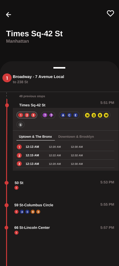
This project focuses on improving the user experience by allowing users to easily access transfer information between different subway lines. The solution was to enable users to tap on the station row to view transfer information and the detailed arrival times.
Project Goals
1. Access to Transfer Information: Allow users to tap on the station row to view transfer information
2. Display real-time transfer information in a concise manner for both northbound and southbound trains, helping users identify which direction the next train is heading
3. Simplify station display information: Using the same method of tapping on station rows, simplify how stations with multiple platforms will be displayed
Challenge
While working to accomplish the project goals, I encountered two main problems. First, I needed to determine the best layout to display transfer information after the user tapped on a subway station. Second, I had to find a concise way to show train directions, particularly for stations with multiple platforms.
Ideate
Users can see their current station -(ex. Briarwood)
and can access transfer information for different subway lines (E trains and F trains) by clicking one of the station rows. This will open up a drop-down which shows which other subway lines are available for transfer at that current station, including the next arrival times for those lines
User would click one of the headings to find the transfer trains wherever headed
Wireframes
Design & Iterations
subway station with multiple platforms
create some mock-ups
do something about the ones underneath Times Sq-42 St disappearing or moving down to the tappable icons
times sq stop will be extended, everything underneath will be moved below the drop-down and fix the spacing between the different trains
the red line on the left will be longer since it is following the drop-down
creating more mockups to showcase how the final version of this feature will look like - utilizing the app’s initial pixel use and replicated it into the mock-ups
iphone 14 screen size
